


Custom 3D Logo Makers


Logo designs from $29
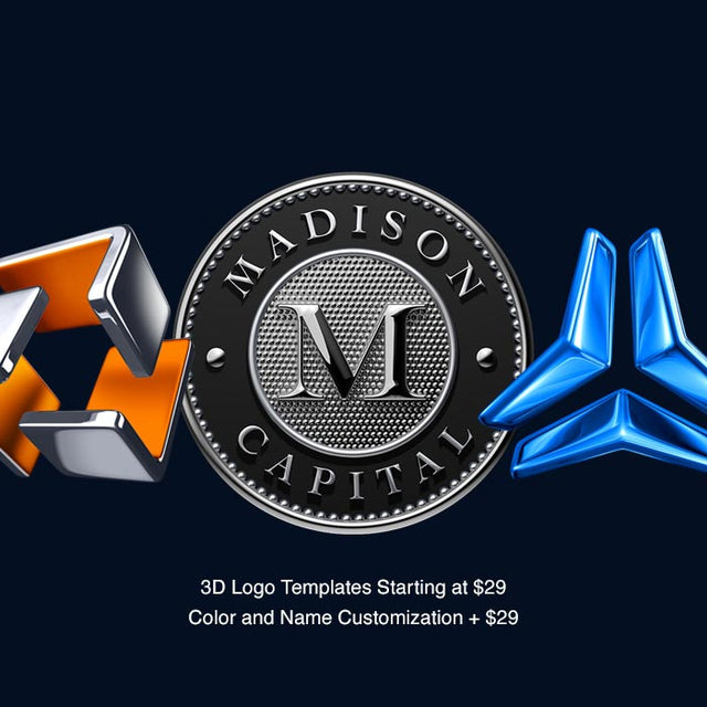
If you're looking for a ready-to-use logo that makes a lasting impression, our 3D logo maker service offers a wide range of professional designs starting at just $29. Ideal for startups and small businesses seeking strong branding without breaking the bank, our diverse logo design library caters to all industries. Each design is crafted by our in-house experts and can be tailored to match your unique branding and identity. Once customized, we provide you with all the necessary formats for online use, printing, and beyond. Explore our collection of customizable logo designs starting at $29 and get started today. Shop Now!
3D Logo Designs
If you're seeking a unique logo that sets your company apart from the competition, explore our extensive collection of ready-to-use 3D logos. As a top choice for innovative and technology-driven brands, 3D logos offer more impact than standard designs by showcasing your brand's commitment to cutting-edge aesthetics. In a competitive market, a 3D logo maker like us can help future-proof your business and elevate your brand perception from day one. With hundreds of static and animated 3D logo designs available, browse our library or connect with our team to get started today.

3D Logo Makers Online
If you want to bring your company logo to another level by making it 3D, we are here to help. Our designers have been 3D logo makers for over 25 years. We use the latest in 3D software technology to create real 3D logos.
We can have your logo created in 3D in just a few days. Our starting price for 3D logos is 250. All logos are different, and the project cost might change according to the complexity of the logo and your demands; thankfully, getting a quote is free. Once we accept the project, we guarantee you will be satisfied with the final design.
To start the project, show us your logo, and we'll give you our ideas and the exact cost.
How To Create a 3D Logo
1. Contact and Discuss Your Project
Initial Communication: Reach out to our team of professional 3D logo makers to discuss your project. Provide a detailed description of what you’re looking to achieve with your 3D logo. If you have any ideas, sketches, or specific visions in mind, we can work directly with those. Alternatively, if you’re starting from scratch, our 3D logo makers can also offer creative suggestions tailored to your brand’s identity and goals.
2. Receive a Quote
Comprehensive Quote: After thoroughly understanding your project, our 3D logo makers will provide you with a detailed quote. This quote will cover the costs associated with creating your 3D logo, including any additional services you may require. We’ll also provide an estimated timeline so you’ll know when to expect the first drafts and final delivery.
3. Create Samples
Sample Development: Our team of skilled 3D logo makers will create several initial samples for you to choose from. These samples will reflect different styles, layouts, and concepts, giving you a variety of options to consider. This stage allows you to visualize how different approaches could represent your brand.
4. Revisions and Finalization
Feedback and Refinement: Once you’ve chosen a sample that aligns with your vision, our 3D logo makers will work on refining the design. We take your feedback seriously and will make any necessary changes to ensure the final result is exactly what you want. This collaborative process ensures that the final 3D logo truly represents your brand.
5. Deliver Final Logos
Multiple Formats: After finalizing the design, our 3D logo makers will deliver the completed logo in all necessary formats. Whether you need high-resolution files for print, or web optimized pngs, or 3D STL file for 3D printing, we ensure that you have everything you need to use your new logo effectively across all platforms.
This process ensures that you receive a custom-designed 3D logo from expert 3D logo makers that perfectly fits your brand’s identity and meets all your requirements.

